Red is the fastest way to change the read of a neutral outfit. One piece — a bag, a shoe, a scarf — and the whole thing looks deliberate. The problem is most people either use too much of it or pick a shade that works against them.
Why Red Works as an Accent Color
Of all the colors that function as accents — cobalt blue, forest green, camel, mustard — red has the strongest visual weight. Not because of cultural association or current trends. Because of how the eye processes it.
Red Gets the Eye First
Visual attention research shows consistently that red objects receive fixation before objects in other colors, even when placed off-center in a frame. In practical terms: when you add a red piece to an outfit, you are deciding where the viewer’s eye lands first.
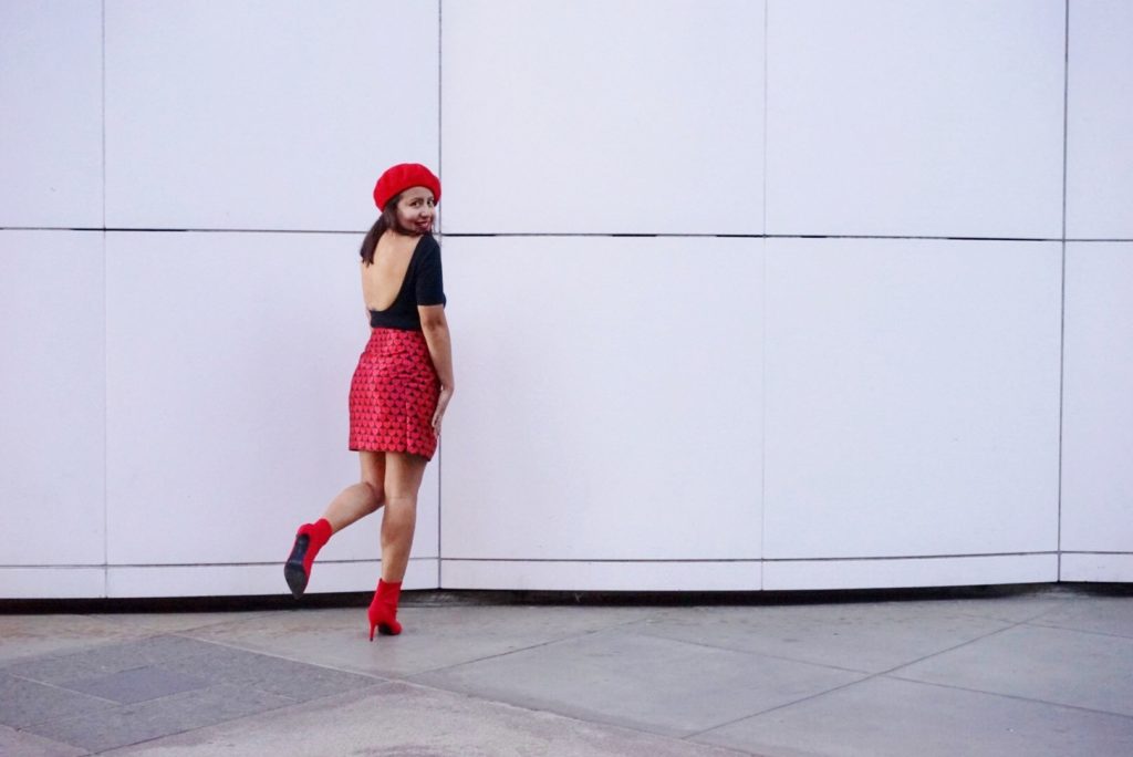
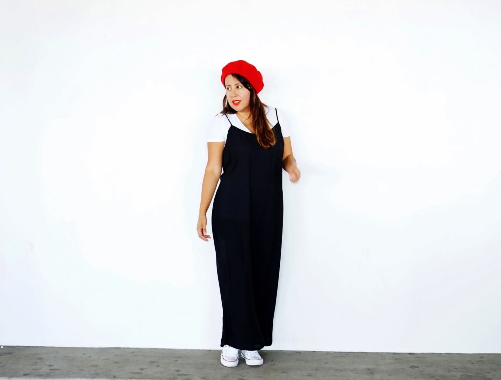
A red shoe in an all-black outfit becomes the focal point. The rest of the outfit becomes the frame. You’ve designed a hierarchy of attention without consciously deciding to — and that’s exactly what a well-styled outfit needs. Clarity about where to look.
This same mechanic applies to red bags, scarves, belts, and even nail color. One red element and the eye has a destination. Remove it and a neutral outfit can feel unresolved, like a sentence missing its point.
Why Neutrals Are the Only Real Background for Red
White, black, grey, navy, camel, beige, cream. That’s the complete list of backgrounds that let red do its job properly.
Red against a floral print competes rather than accents. Red against olive green muddies both the warmth of the red and the earthiness of the olive. Red against mustard sits in the same warm temperature band and cancels the contrast you’re trying to create. The neutral background is what gives red the contrast ratio it needs — and contrast ratio is what makes the accent read as intentional rather than accidental.
Grey is underused here. Charcoal grey creates sharper visual contrast with red than black does, because the cool-warm tension is stronger. A grey wool coat with a single red bag often reads cleaner than the same setup in black. Worth testing before dismissing.
Camel is another underrated neutral for red. The warm-neutral pairing reads rich and considered — particularly with a cherry red or burgundy accent, where the contrast between the two is enough to be distinct without fighting.
The One-Red-Piece Rule
One red item when working against a neutral base. Not two.
A red bag and red shoes in the same neutral outfit creates two focal points with no hierarchy. The eye bounces between them without resolving. What should read as an accent reads as costume.
A red scarf tied to a bag handle doesn’t violate this — both are part of a single accessory and read as one accent item. But a red shoulder bag paired with red ankle boots in a neutral outfit consistently tips over the line, regardless of how good each piece is individually.
Full red outfits — red coat, red trousers, a complete monochromatic look — operate on entirely different logic. That’s a statement, not an accent approach, and the repetition itself becomes the design choice. These rules apply specifically to the one-piece-against-neutrals method.
Shade Selection Is Half the Battle
Most people pick a red they like in the store and wonder why it feels slightly wrong once they’re wearing it. The answer is almost always shade. There are six meaningfully different reds, and buying the wrong one for your skin tone or outfit palette means you won’t reach for the piece.
| Red Shade | Undertone | Best Outfit Pairings | Best Skin Undertones |
|---|---|---|---|
| True Red | Neutral | White, black, mid-grey | Neutral |
| Tomato Red | Warm (orange-leaning) | Cream, camel, warm grey, brown | Warm, olive |
| Cherry Red | Cool (blue-leaning) | Navy, charcoal, cool grey | Fair, cool-toned |
| Burgundy | Deep, cool | Camel, navy, blush, forest green | All skin tones |
| Scarlet | Warm-neutral | Black, white, khaki | Warm, medium |
| Rust Red | Warm, earthy | Brown, forest green, off-white | Deep, warm |
Burgundy is the most forgiving shade on this list. It reads as red without the full intensity of true red, and it works across skin tones and outfit palettes in a way that tomato or cherry red won’t. If you’re buying your first red piece and want to minimize risk, burgundy is the practical choice.
How to Tell Warm Reds From Cool Reds
Hold the red piece next to a sheet of white paper in natural daylight — not indoor lighting, which distorts color temperature. If it pulls toward orange, it’s warm. If it pulls toward pink or purple, it’s cool. This takes ten seconds and matters more than most styling decisions you’ll make around the piece.
Warm reds create visual tension against cool-toned outfits and cool skin undertones, and vice versa. That tension doesn’t read as daring. It reads as slightly wrong, and the wearer rarely knows why.
Matching Shade to Skin Undertone
Cool undertones — veins appear blue or purple, silver jewelry suits you better than gold — suit cherry red, crimson, and burgundy. The blue in these reds aligns with your natural coloring.
Warm undertones — veins appear green, gold flatters you — suit tomato red, scarlet, and rust. The warmth connects.
Neutral undertones have the most flexibility. When uncertain, choose by outfit palette rather than skin tone: mostly navy and charcoal in your wardrobe, lean cherry; mostly camel and cream, go tomato.
5 Red Pieces Worth Actually Buying
Real products, specific prices, clear reasoning. These span different budgets and different functions — from everyday versatility to occasion-specific statement work.
-
Toteme Monogram Jacquard Scarf in Red (~$220) — The easiest entry point into red accents. Heavy enough to hold its shape knotted at the neck over a black coat or tied to a bag handle. Toteme’s scarves hold structure and don’t pill with regular wear. If you own zero red pieces, this is where to start: maximum versatility, minimum commitment.
-
Mansur Gavriel Mini Bucket Bag in Red (~$495) — The brand made their name on this bag in this color, and the logic still holds. Vegetable-tanned leather, structured silhouette, works from daytime through evening. The red deepens slightly as the leather breaks in over time. Against a camel trench or charcoal wool coat, it’s one of the cleanest executions of the red accent available at this price.
-
A.P.C. Half-Moon Mini Bag in Rouge (~$350) — More minimal than the Mansur Gavriel, smaller profile, cleaner lines. The rouge colorway leans cherry — cool-undertoned — which makes it the right pick if your wardrobe runs primarily navy and charcoal. Brushed hardware, compact size, transitions from work through dinner without effort.
-
Jacquemus Le Chiquito Noeud in Rouge (~$590) — A statement piece rather than a daily workhorse. The Le Chiquito is small enough that it isn’t practically functional, but its silhouette is distinctive enough to justify the cost as a pure accent item. Pairs best with column-shaped clothing: a long black dress, straight-leg trousers, a minimal slip skirt. A specific tool for a specific outfit type.
-
& Other Stories Red Point-Toe Flats (~$95) — The best budget option in this category. The pointed toe reads considerably more considered than a round toe at the same price. Wear with straight-leg denim and a white shirt and the complete outfit costs under $200 while looking deliberate. This style or a close variant returns to & Other Stories every spring.
Color Combinations That Work — and the Ones That Don’t
The range of colors that pair well with a red accent is narrower than most people expect. Getting this wrong produces an outfit that reads almost-right but slightly off — which is often worse than a clearly incorrect combination, because the problem is harder to name.
Does Red Work With Pink?
Sometimes. But only with a clear difference in depth or saturation between the two. Burgundy with dusty rose: yes — the deep cool red and the muted pink create a tonal pairing that reads deliberate. Tomato red with hot pink or fuchsia: no. The warmth of the tomato and the cool intensity of hot pink create tension with no visual resolution.
Working rule: if red and pink are in the same outfit, one must be muted, desaturated, or deep. Two saturated shades at similar intensity almost always reads as excess.
Can You Pair Red With Orange?
No. Red and orange are adjacent on the color wheel — analogous — and they merge into something indistinct when placed together in the same outfit. Neither can function as a focal point against the other. Keep orange out of any outfit where red is doing accent work.
What About Navy, Black, or Brown?
Navy is the strongest and most underused pairing. Cherry red against navy wool is precise and intentional — the combination has a long enough sartorial history that it reads as confident rather than trying. Particularly effective in autumn and winter.
Black is foolproof. It’s also the safe default. Start with black and red before experimenting further.
Brown is the most interesting call. A tomato red shoe or bag with cognac or caramel brown leather creates a warm-palette combination that reads unexpected in a good way. Specifically cognac — not dark chocolate brown, which pulls too dark and cool for the warmth of tomato red. Rust red also works in this palette: rust trousers, cognac boots, and a cream knit is a fully warm outfit that reads fully considered.
Three Mistakes That Make Red Look Cheap
Synthetic fabric. Polyester red reads garish in a way that wool, leather, and silk don’t — the saturation is too uniform, the texture too flat. Gold hardware on a budget bag, where the combination amplifies the cheapness of both. More than one red accent in a neutral outfit.
The subtler fourth mistake: buying the wrong shade for your coloring, sensing something is off without knowing exactly why, and leaving it unworn. A $500 bag you don’t reach for costs more than a $95 flat you wear three times a week. Shade matching isn’t fussy — it determines whether you actually wear the piece.
When Red Is the Wrong Tool
Red is the wrong call when your outfit already has a focal point.
A statement print coat, bold textural element, or strong jewelry is already directing the eye. Adding red creates a second focal point with no hierarchy between it and the first. The outfit stops reading as intentional and starts reading as busy. Red needs a quiet outfit behind it to work — that’s the deal.
Formal occasions with strict dress codes are another case. A red clutch at black tie requires enough confidence to land as deliberate provocation rather than accident. If there’s uncertainty about that read, black satin or gold metallic does the job cleanly.
If red genuinely doesn’t suit you — you’ve tried cherry, tomato, scarlet, and burgundy, and none of them feel right in your wardrobe or against your face — stop. This happens. Not every person has a wardrobe that activates red, and forcing it tends to produce one expensive piece worn twice. Cobalt blue, forest green, and camel all perform the same structural function: they anchor the eye in a neutral outfit and make the whole look feel complete. The Polène Numéro Un Mini in camel (~$185) does exactly what a red bag does against neutrals. It anchors the eye. It completes the outfit. It just does it with warmth rather than high contrast.
Red is a specific tool. Use it when the outfit needs what red specifically offers. Don’t use it because it’s the obvious accent color.