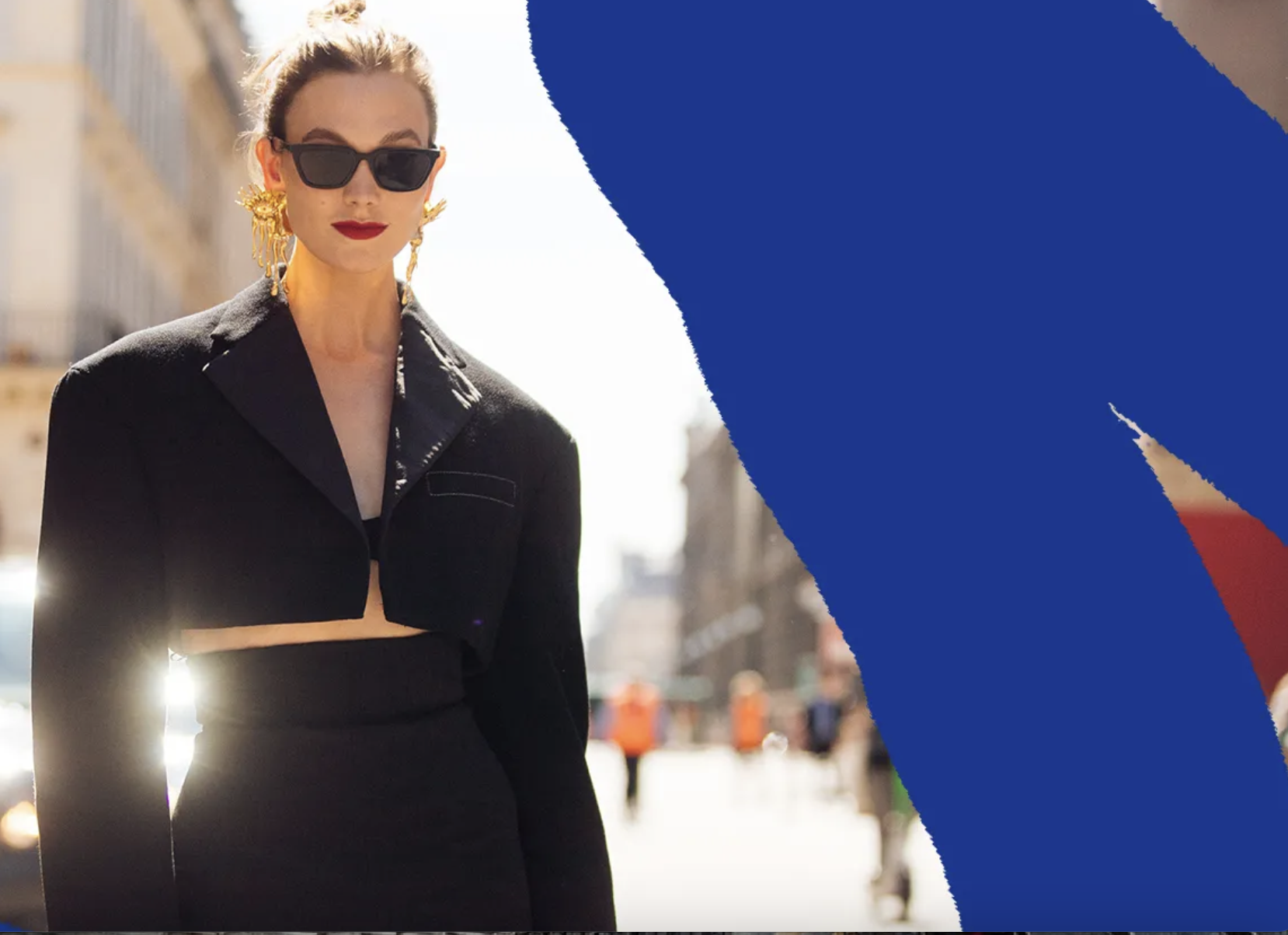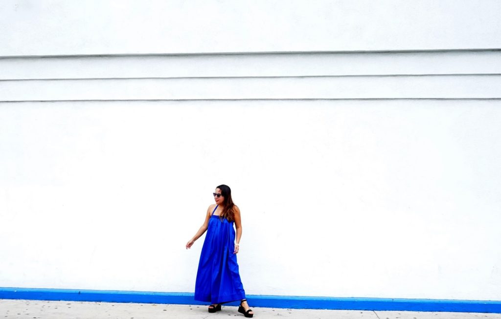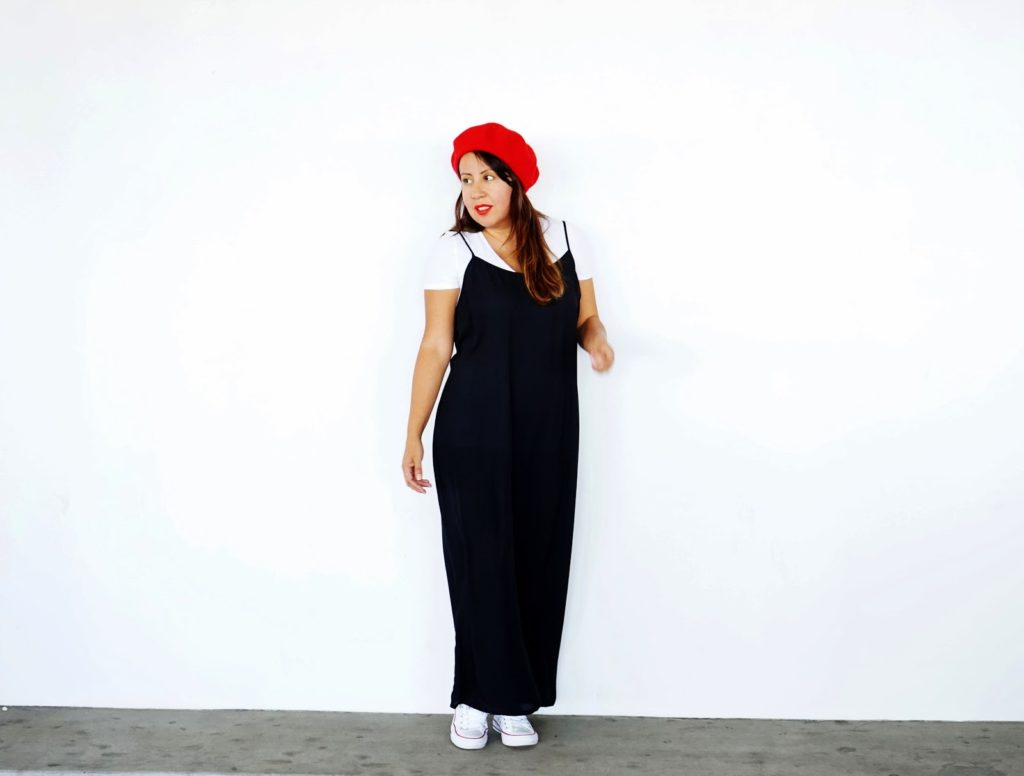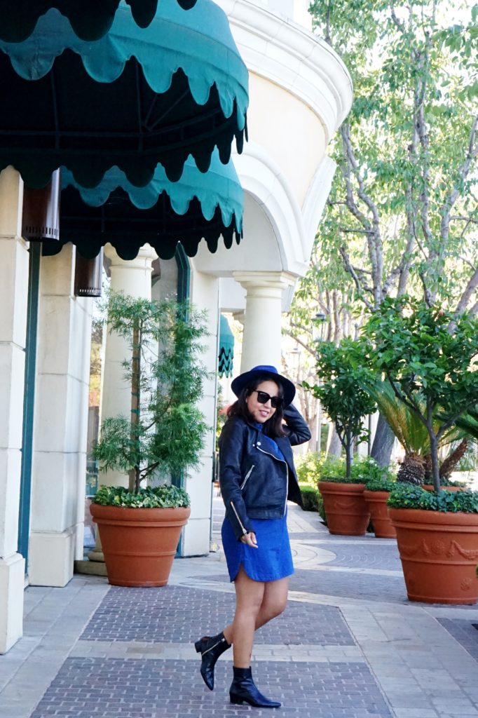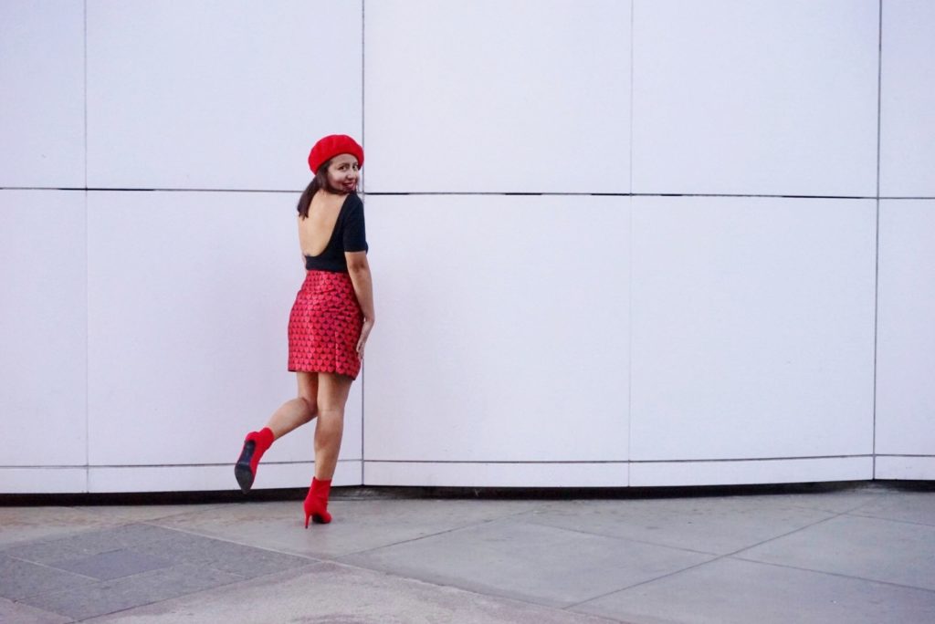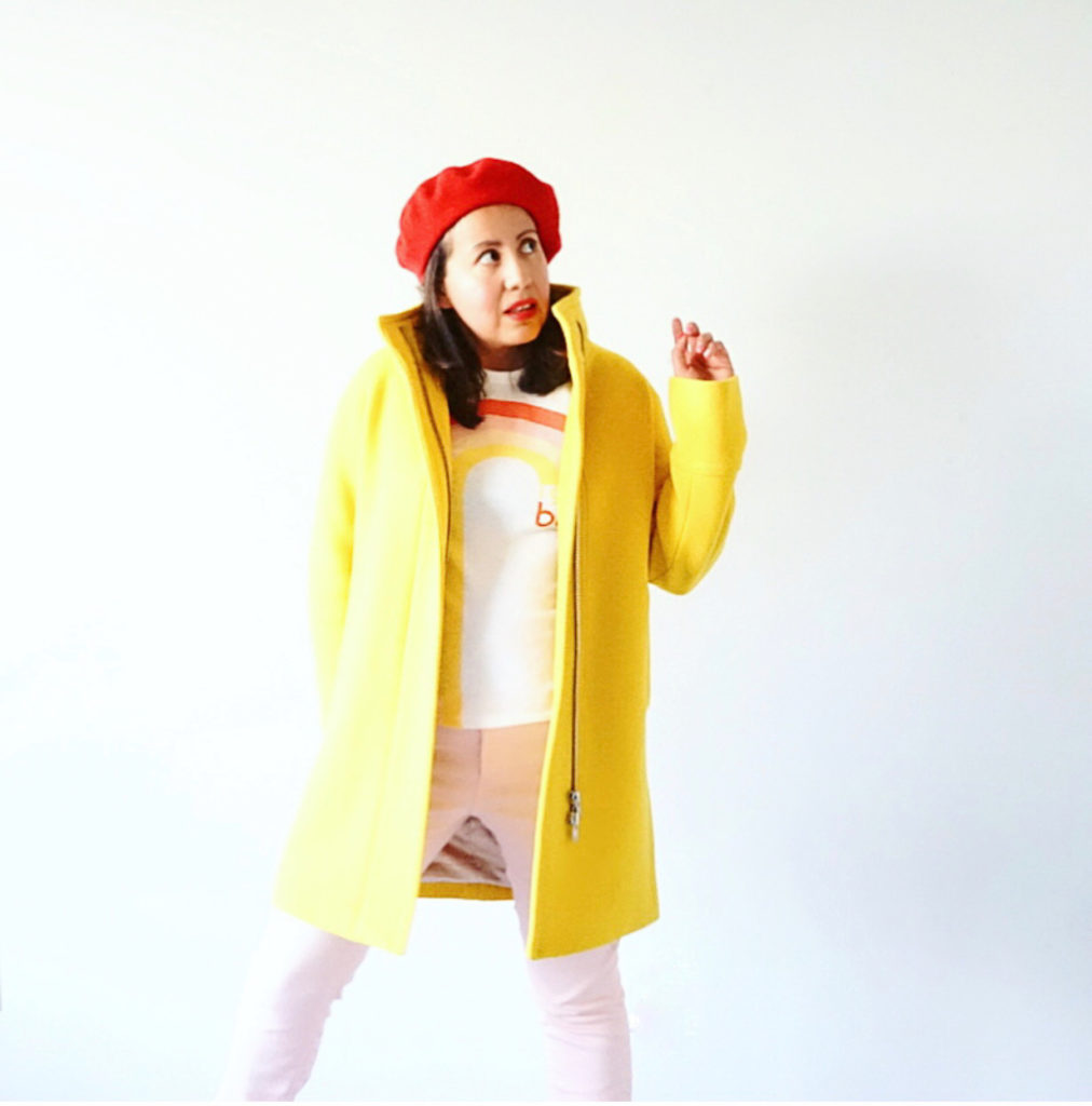
Street style photographers spotted it before the rest of us. Cobalt blue coats. Tangerine trousers. Acid yellow bags swinging off shoulders that hadn’t touched color in three years. The color rush didn’t sneak in — it arrived fast, and by the time runway recaps hit feeds, it had already filtered down to every price point.
Here’s what’s actually worth wearing, what to skip, and which pieces justify the spend.
Why the Color Rush Has Outlasted Every Other Recent Trend
Most trend cycles die at the 18-month mark. Quiet luxury had its moment. Coastal grandmother peaked and receded. But the color rush has been accelerating since late 2026, and search volume data backs it up — queries for “cobalt blue outfit” jumped over 300% between 2026 and 2026, according to fashion analytics platform Trendalytics. That’s not a blip. That’s sustained, compounding demand.
The reason it’s sticking is structural, not seasonal.
After three years of muted dressing — greige, sage, oat-everything — the fashion cycle swung hard in the opposite direction. This is textbook Laver’s Law: what reads as “calming” in one decade reads as “boring” in the next. Color didn’t just come back. It came back plural. Six or seven distinct shades are sharing the spotlight simultaneously, which makes this wave more durable than single-color moments. When no single brand owns a color, you’re not locked into a trend that expires with a single collection.
What Made the Valentino Pink PP Moment Different
Valentino’s 2026 Pink PP collection was a masterclass in mono-color dressing — and also a cautionary tale. When one brand owns a color that completely, wearing it outside that specific cultural moment reads as pastiche. The 2026 color rush is decentralized. No single designer owns cobalt blue. No single label owns tangerine. That means bold pieces from this cycle carry a longer useful life. A cobalt bag bought in 2026 doesn’t expire when a creative director changes direction. That changes the investment math significantly — it shifts bold color from trend purchase to versatile asset.
The Psychology Behind Why Color Works in Fashion
Color psychology in fashion isn’t mystical. It’s documented. Research from the Fashion Institute of Technology found that consumers exposed to bold color choices in retail environments report measurably higher purchase intent than in neutral, monochromatic spaces. Brands like Loewe and Jacquemus have spent years building visual identities around color precisely because it functions as a signal — confidence, memorability, approachability. The people who wear color well aren’t performing trends. They’ve noticed that it works, and they keep doing it.
The 6 Colors in the Color Rush — Ranked by Wearability
Not all bold colors are equally forgiving. Here’s how the six dominant shades of the color rush stack up in terms of versatility, skin tone range, and ease of styling — from easiest to hardest to wear well.
| Color | Wearability | Best Entry Point | Works Best On | Watch Out For |
|---|---|---|---|---|
| Cobalt Blue | 9/10 | Structured bag or shoe | All skin tones | Shade drift — cobalt ≠ royal blue ≠ navy |
| Tangerine / Burnt Orange | 8/10 | Linen blazer or wool scarf | Deep and medium skin tones | Wrong fabric reads Halloween, not fashion |
| Cherry Red | 8/10 | Structured top-handle bag or loafers | Universal — olive and cool tones especially | Clashes badly with warm pinks nearby |
| Hot Pink / Magenta | 7/10 | Wool knit or small earrings | Cool and neutral undertones | Saturation level is everything — one degree too much tips to neon |
| Acid / Butter Yellow | 6/10 | Small bag only to start | Deep skin tones, warm undertones | Washes out lighter complexions badly in clothing form |
| Lime Green | 5/10 | Single accent piece only | Dark skin tones, high-contrast styling | Easiest color in this list to read as costume |
Cobalt blue is the clearest entry point for anyone cautious about color. It photographs well, reads sophisticated rather than playful, and flatters virtually every skin tone. If you’re new to the color rush, start at the top of this table and move down only as your confidence — and wardrobe — grows.
How to Add Bold Color When Your Wardrobe Is Mostly Neutrals
The biggest mistake isn’t buying the wrong color. It’s buying bold color the wrong way — and then never wearing it because it won’t pair with anything you own. These three approaches prevent exactly that failure.
Start With Accessories, Not Clothing
A cobalt blue bag next to a navy blazer and cream trousers is easy to style. A cobalt blue blazer next to a navy bag and cream trousers is significantly harder to pull off. Accessories let you test whether a color actually works within your existing wardrobe before committing to a full garment. The risk is lower, the learning is faster, and you’re not standing in front of your closet holding an unworn blazer wondering what went wrong.
The Jacquemus Le Bambimou bag in Yellow Lemon (~$750) demonstrates this principle cleanly. One loud piece, and every neutral outfit you own suddenly has a focal point. The bag does all the work. You don’t have to rebuild your wardrobe around it.
Monochromatic Bold Is Easier Than Mixed Bold
Head-to-toe in a single color is actually easier to execute than mixing two bold colors together. A full cobalt look — cobalt blazer over cobalt wide-leg trousers — reads as intentional and considered. Two different bold colors worn simultaneously requires real, working knowledge of color theory to avoid looking chaotic. This is exactly why Loewe and Bottega Veneta build so many monochromatic campaigns. It’s not a creative limitation. It works because your eye processes a single bold statement more cleanly than competing ones do.
Match Undertones, Not Just the Hue
There are warm yellows and cool yellows. Warm pinks and cool pinks. Tangerine skews warm-orange; hot pink skews cool-purple. When bold colors clash against each other, it’s almost always an undertone mismatch rather than a hue problem. Buy pieces in the same temperature family — warm with warm, cool with cool — and combining bold becomes dramatically more manageable. This one rule solves about 70% of color clash problems before they start.
Tip: Before buying any bold piece online, check how it renders in natural light on your screen rather than against the white retailer background. Fashion photography routinely oversaturates bold colors, and what arrives can look noticeably different — sometimes more washed out, sometimes more neon — than what you ordered.
Four Color Rush Mistakes That Kill an Otherwise Good Outfit
Stylists who work with color-forward wardrobes see the same failure patterns repeatedly. These four come up constantly.
- Buying bold with nothing to pair it with. You own twelve neutral pieces and you add one electric yellow dress. It either becomes the only outfit you build around itself — or it hangs unworn because nothing else goes with it. Before buying bold, identify three specific outfits from your existing wardrobe you’d build around the piece. If you can’t name them, don’t buy it.
- Chasing the exact runway shade. Runway cobalt and retail cobalt are often two different colors. Obsessing over matching the precise Pantone from a show means you’ll either overspend dramatically or stay permanently disappointed. Find the version of the color that flatters you specifically — not the version in a lookbook.
- Three bold pieces at once. A cherry red bag, cherry red shoes, and a cherry red belt is a costume. Pick one hero piece. Let everything else read neutral and let the color breathe.
- Ignoring fabric weight. Tangerine in structured linen reads clean and considered. Tangerine in thin, drapy polyester reads cheap and fast. Bold color in low-quality fabric gets exposed in a way that muted tones never do — the color pulls attention directly to the construction flaws. A bold piece needs better fabric than you’d require for the same silhouette in beige.
When to Skip the Color Rush Entirely
If your professional environment requires conservative dress, or if you’re building a capsule wardrobe meant to last ten-plus years without looking trend-dated, skip the loud pieces. Cobalt blue clothing is a trend bet — it may hold, it may not. A black leather bag or a well-cut camel coat will never need defending to anyone.
The Specific Pieces Worth Buying Right Now
Across the six color categories, here’s what delivers genuine value at each price tier — with a clear pick for each one.
Cobalt Blue: The Bottega Veneta Jodie Bag in Cobalt (~$3,500) is the benchmark piece for this entire color cycle — every other cobalt bag is being measured against it. If that’s out of range, the Mango Leather Tote in Electric Blue (~$120) lands remarkably close in color intensity and holds its shape across seasons. The Bottega holds resale value and will still look current in five years. The Mango doesn’t need to do either of those things.
Tip: When buying a bold-colored leather bag, look for full-grain or top-grain leather rather than bonded leather. Bold dye jobs fade more visibly on bonded leather, which splits and peels differently than real leather ages. A cobalt bonded leather bag that begins cracking looks significantly worse than a neutral leather bag doing the same — the color amplifies every structural flaw.
Tangerine: The Zara Linen Blazer in Tangerine (~$90) is one of the most accessible entry points in the color rush right now. Linen is the correct fabric for this color — structured enough to read intentional, natural enough to keep the brightness from looking synthetic. Style it over white wide-leg trousers in summer, or layer over a black turtleneck when the season shifts. At $90, you can afford to test whether tangerine actually works in your wardrobe before spending more.
Cherry Red: Staud’s Benny Bag in cherry red (~$295) threads the needle between formal and expressive. The structured top-handle silhouette keeps it professional enough for office use, but the color hits hard enough for evening. Cherry red reads sophisticated in a way that lime green or hot pink doesn’t right now — it’s the most cross-context bold bag available at this price point, and the pick if you want one bold bag that works across the most situations.
Tip: For bold color clothing specifically, hand wash or use a mesh laundry bag on cold-delicate cycles. Bold dyes run faster than neutrals, and the first few washes carry the highest risk. A cherry red shirt bleeding onto other pieces is a considerably more expensive mistake than a white shirt doing the same thing.
Hot Pink: Acne Studios’ wool-blend sweater in magenta (~$450) sits at a saturation level that’s bold without tipping into neon. The wool-blend makes it wearable through autumn and winter, and magenta’s cool-purple lean makes it easier to style with navy, grey, and ivory than warmer pinks would be. This is the hot pink buy if you want a clothing piece rather than an accessory — it earns its place in an actual wardrobe, not just a trend photo.
Acid Yellow: Start with the Jacquemus Le Bambimou bag in Yellow Lemon (~$750) and resist buying yellow clothing until you’re confident with undertone matching. Yellow in garment form washes out cooler complexions and requires careful color temperature awareness across the whole outfit. In small bag form, it functions purely as a pop of contrast against neutrals — pair it with white, navy, or camel, all three work — without demanding the coordination that a yellow dress or blazer would.
The photographers who first spotted those cobalt coats on Milan sidewalks weren’t documenting a passing moment. They were watching a full fashion cycle turn — and the turn has been thorough enough that even a single bold piece, worn with intention, places you inside one of fashion’s most sustained color stories in a decade.